


Objective To highlight the city of origin of the products where the farm is located — Mosalsk. The farm produces a limited number of products every year, which makes the product unique.
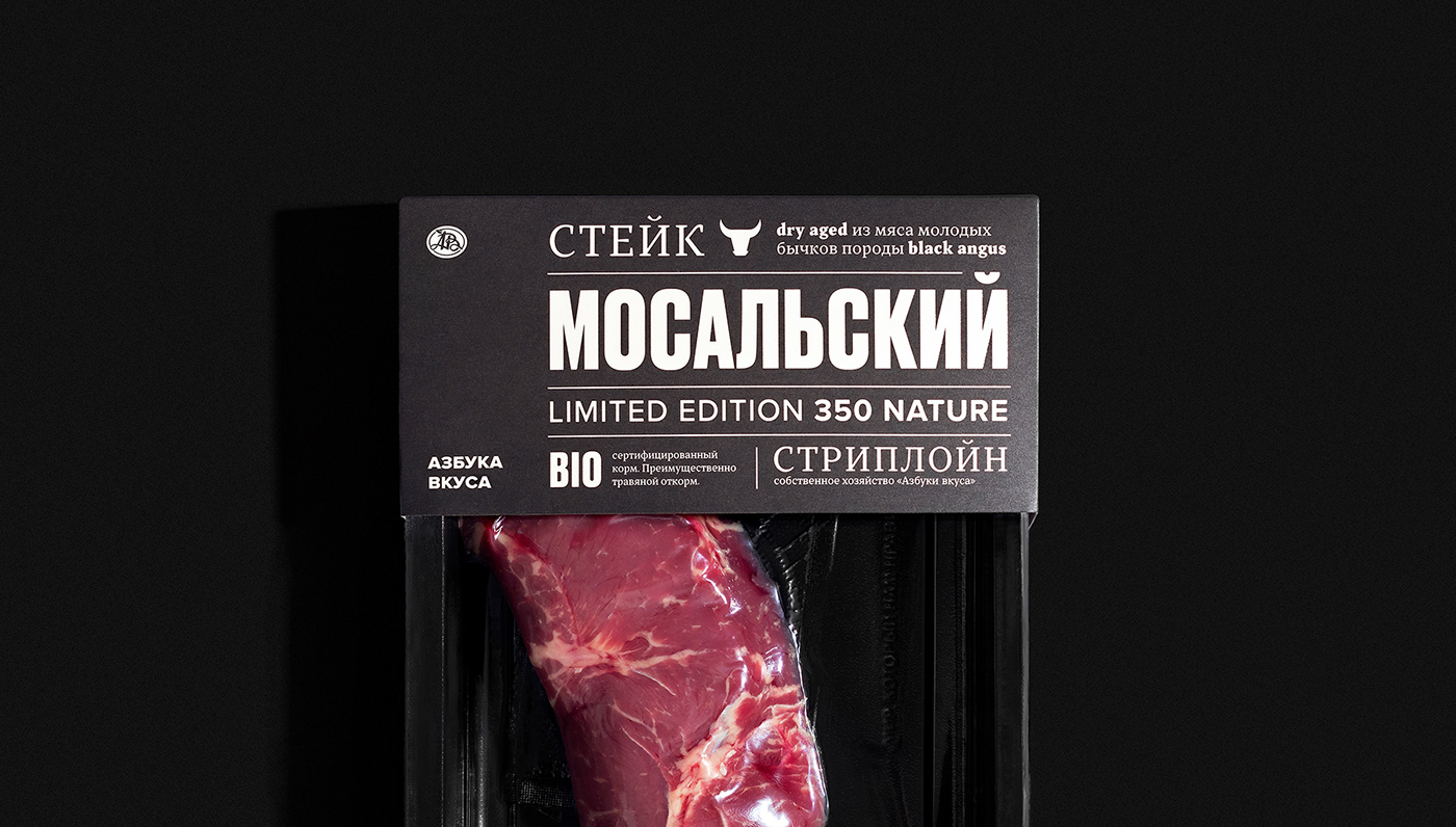
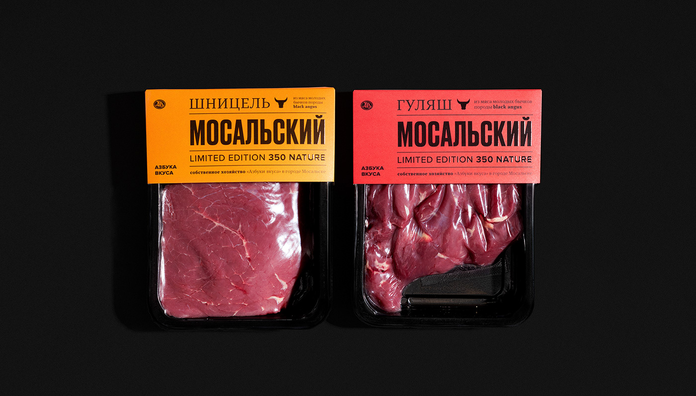
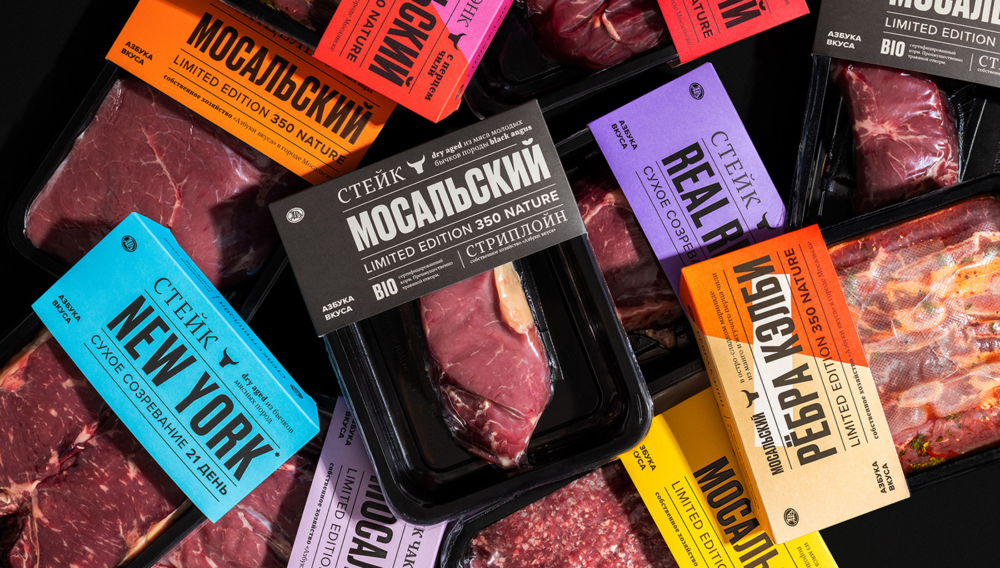
The first in the line of products were the flagship steaks, which we named "Mosalsky" to create a bond with this product. Our product is unique, we wanted to move away from solutions generally accepted in the local market — predominantly using black and photographs of the finished product.
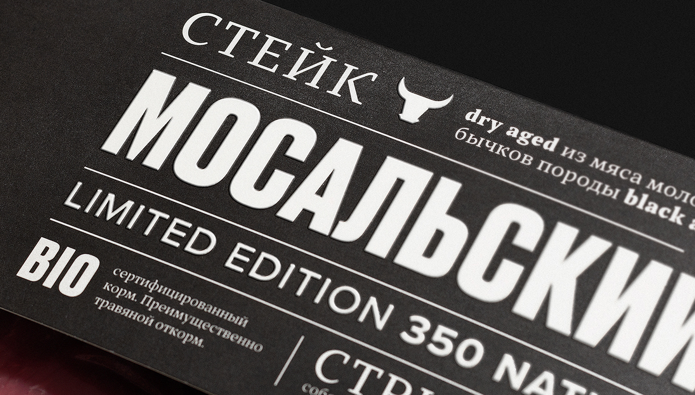
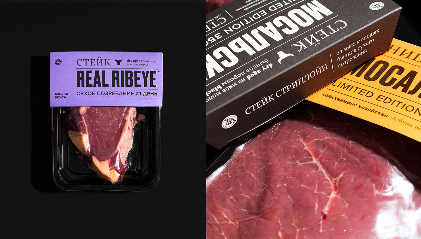
Solution We chose a different path — we created an exclusively typographic solution. The main idea is to make a loud statement from the shelf about a new product, as compared to how they write about the main news in the newspapers. At the heart of the design system is a solid typographic block that grabs attention and tells the consumer what the product is.
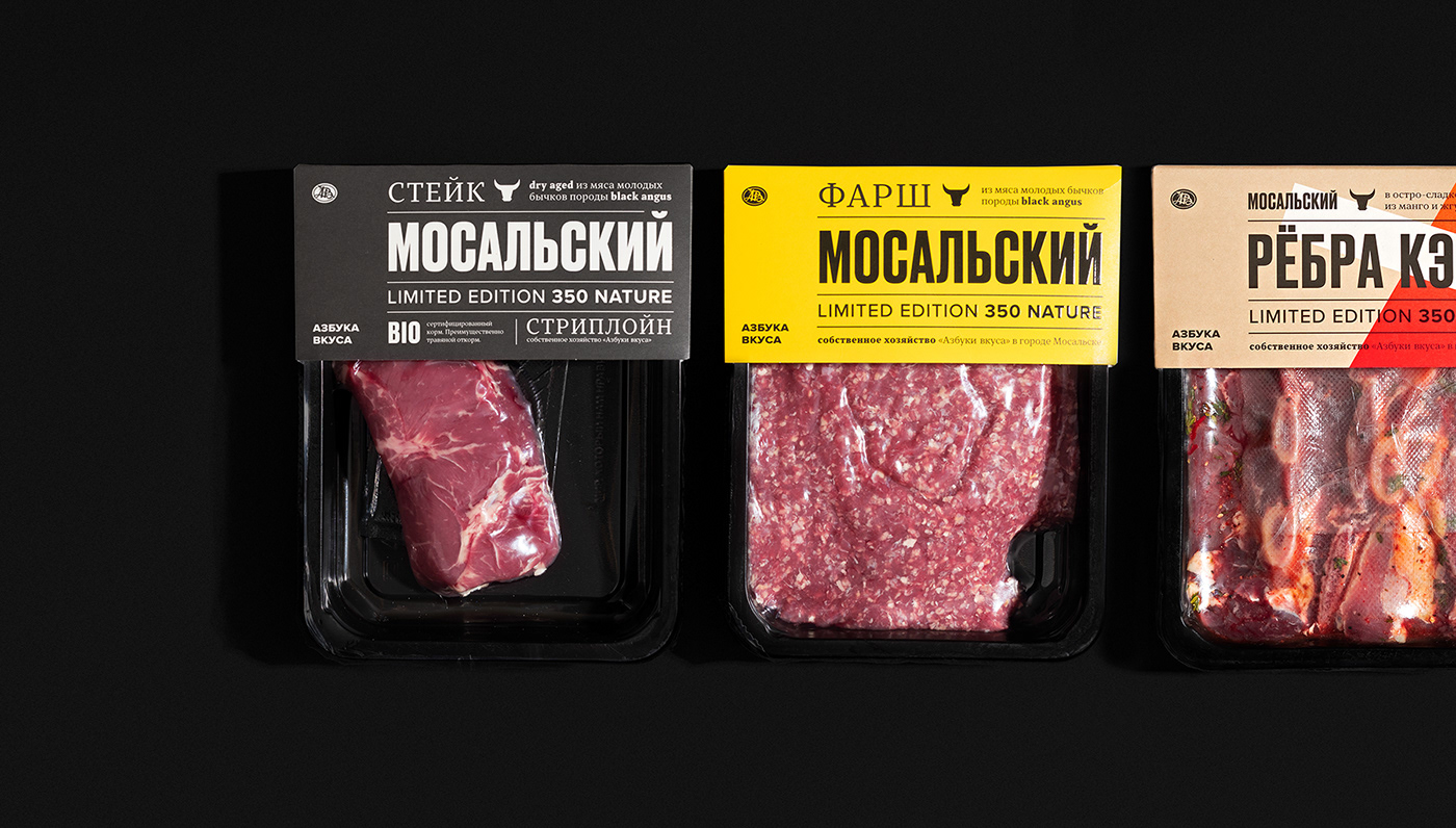
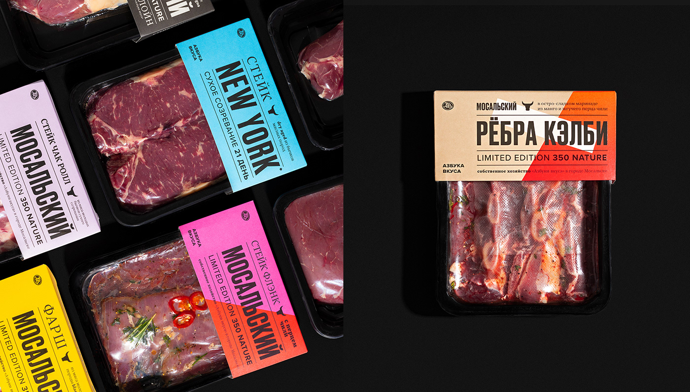
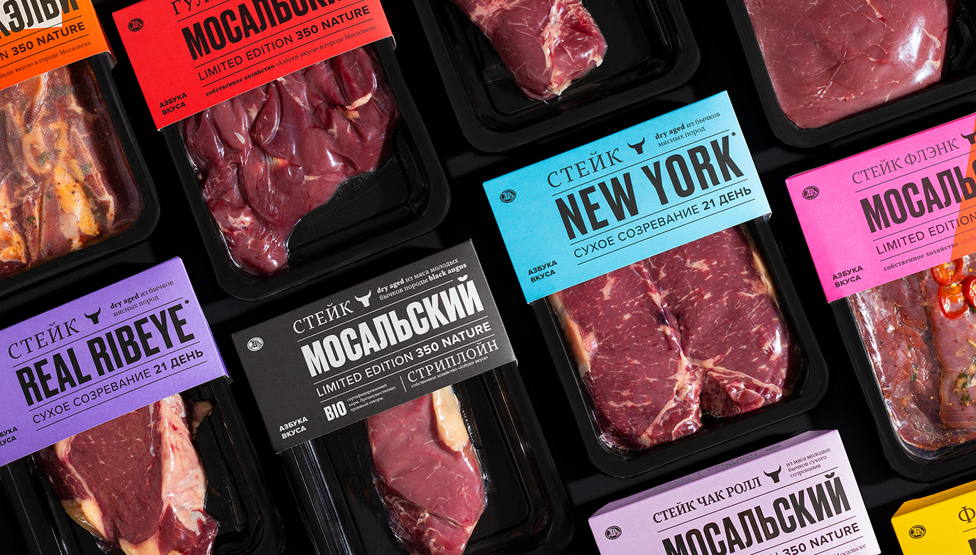
In using color, we also decided to go against the market, because most competitors in the Russian market do not use color in their designs when they work with meat. We make a product for the modern consumer in the modern world and we know how to work with color. Therefore, we have a bright color division of the product, which allows the consumer not to get confused in the products.
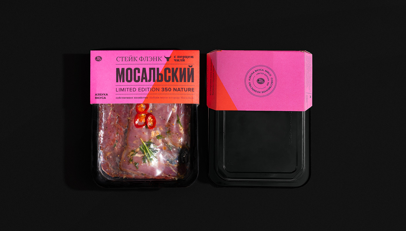
We also used abstract shapes in products that use additional ingredients. For example, a flank steak with chili is split in half and red is added to the main pink color of the steak. And in products on the bone, an abstract white rectangle is added to symbolize the bone. Simple shapes help the shopper quickly read product characteristics and easily distinguish from the shelf in minutes.
As a result, we got a fundamentally new approach for Russian retail in the field of meat products.
The first in the line of products were the flagship steaks, which we named "Mosalsky" to create a bond with this product. Our product is unique, we wanted to move away from solutions generally accepted in the local market — predominantly using black and photographs of the finished product.
Solution We chose a different path — we created an exclusively typographic solution. The main idea is to make a loud statement from the shelf about a new product, as compared to how they write about the main news in the newspapers. At the heart of the design system is a solid typographic block that grabs attention and tells the consumer what the product is.
In using color, we also decided to go against the market, because most competitors in the Russian market do not use color in their designs when they work with meat. We make a product for the modern consumer in the modern world and we know how to work with color. Therefore, we have a bright color division of the product, which allows the consumer not to get confused in the products.
We also used abstract shapes in products that use additional ingredients. For example, a flank steak with chili is split in half and red is added to the main pink color of the steak. And in products on the bone, an abstract white rectangle is added to symbolize the bone. Simple shapes help the shopper quickly read product characteristics and easily distinguish from the shelf in minutes.
As a result, we got a fundamentally new approach for Russian retail in the field of meat products.
Задача Вывести на первый план город происхождения продукции, на которой расположена ферма — Мосальск. Ежегодно ферма производит ограниченное количество продукции, что делает продукт уникальным.
Первыми в линейке продуктов были флагманские стейки, которые мы назвали «Мосальский», чтобы создать связь с этим продуктом. Наш продукт уникальный, нам хотелось отойти от общепринятых на локальном рынке решений, т.е. преимущественно использование черного цвета и фотографий готового продукта.
Решение Мы пошли иным путём — создали исключительно типографическое решение. Основная идея — сделать громкое заявление с полки о новом продукте, сравни тому как пишут о главной новости в газетах. В основе дизайн-системы лежит крепкий типографический блок, который привлекает внимание и рассказывает потребителю, что это за продукт.
В использовании цвета мы также решили пойти против рынка, ведь большинство конкурентов на российском рынке не задействует в своем дизайне цвет, когда работают с мясом. Мы же делаем продукт для современного потребителя в современном мире и умеем работать с цветом. Поэтому у нас появилось яркое цветовое деление продукта, которое позволяет потребителю не путаться в продуктах.
Также мы использовали абстрактные формы в продуктах, где используются дополнительные ингредиенты. Например, упаковка фланк стейка с добавлением перца чили делится цветом пополам и к основному розовому цвету стейка добавляется красный цвет. А в продуктах на кости добавляется абстрактный белый прямоугольник, символизирующий кость. Простые формы помогают покупателю быстро считывать характеристики продуктов и легко различать из на полке за считаные минуты.
В итоге мы получили принципиально новый подход для русского ритейла в сфере мясных продуктов.
Design director Arnis Millers
Art director Alexandra Loginevskaya
Design & layout Alexandra Loginevskaya,
Illustrations Valeria Ponomarenko
Photography Daria Kwon
Text Maria Bushueva, Ira Ivanova
Project management Anna Belaya, Dmitrii Ilukevich


